Wagara Five Seasons High-Contrast 3D Printed Domino Set: History (Part One)
Why Make Dominoes with Wagara Backing?
There is a type of design I had seen in rooms in some K-dramas and C-dramas that would catch the eye, even against a backdrop of gorgeous colors and textures. It wasn’t a specific pattern, but rather a style, in which straight lines of different lengths merged, continued, or crossed at 90-degree angles with other lines. I saw this type of art frequently applied to room dividers, inlaid in chests, and added to windows and the like. I wanted to learn the name of this elegant and beautiful style, so I turned to the internet to do some research, and that is how I tumbled into the Wagara rabbit-hole.
Wagara are traditional Japanese patterns, like repeating waves or leaves, and there are a bunch of them, some with special meaning. While learning about the different patterns, I discovered seasonal symbolism, an idea seen in Japanese poetry, as well as certain types of art. I learned about metal inlay techniques, which I could imagine simulating the look of for future prints, and I read about dyeing techniques that made use of negative space. I even discovered an art form that came from taking rubbings of fish!!!
I was deep in the throes of satisfying my curiosity when someone showed me a set of high-contrast prints. They had used the same filament-swap technique I wrote about earlier, but this usage was different. The black base had a white layer painting a design on top, with a layer that was so thin that it looked like it had printed as a solid flat piece. Amazing. No, more like A-MAZING. I liked how the thin light layer made the under-color pop, the whole thing popped, even with simple designs. Negative space, simple designs, high-contrast… this was giving me ideas. What about high-contrast prints made with wagara backgrounds?
I hadn’t found the answer to my initial question about the name of that style of art on the panels, but I found something else: a new project! I’m going to make a series of wagara high-contrast prints for each season. There is a twist to the project: I’m going to use these designs as backs for custom sets of dominoes, matching each season’s dominoes with its own custom box and lid.
Each Set’s Season and Element
While Japan recognizes Spring, Summer, Autumn, and Winter as the four seasons, there is a traditional fifth period of time known as Doyo. Doyo represents the transitional period between the other seasons, being roughly eighteen days preceding each one. Because my research uncovered a cultural aversion to the number four due to its similarity to the Japanese word for 'death’, I decided to include Doyo in the set, as if it were a fifth season. Five seasons, five sets of dominos.
The five elements, water, earth, wood, fire, and metal, together are called Gogyo; I could make each print have a uniquely colored base to represent the season, along with a matching wagara background, an appropriate animal, and the Kanji for the Gogyo element. I chose to use traditional element-season pairings: water for winter, earth for doyo, wood for spring, fire for summer, and metal to pair with autumn.
Wagara History
I first went to Duende, where a traveler who goes by Madam Zozo presented research on Wagara patterns. I learned that these Japanese patterns are steeped in tradition and history. Some of the earliest designs came from Korea and China. According to Madam Zozo this happened between 794 and 1185 AD (known as Japan's Heian period). These nature-based patterns had meanings attached such that clothing with certain designs was worn only for specific occasions.
From 1603 to 1868 AD Japan experienced its Edo period, during which new designs emerged, alongside those that had evolved with time and those that had remained unchanged. Time did more than give room for patterns to evolve however — it also began to erase the meanings behind the wearing of the wagara.
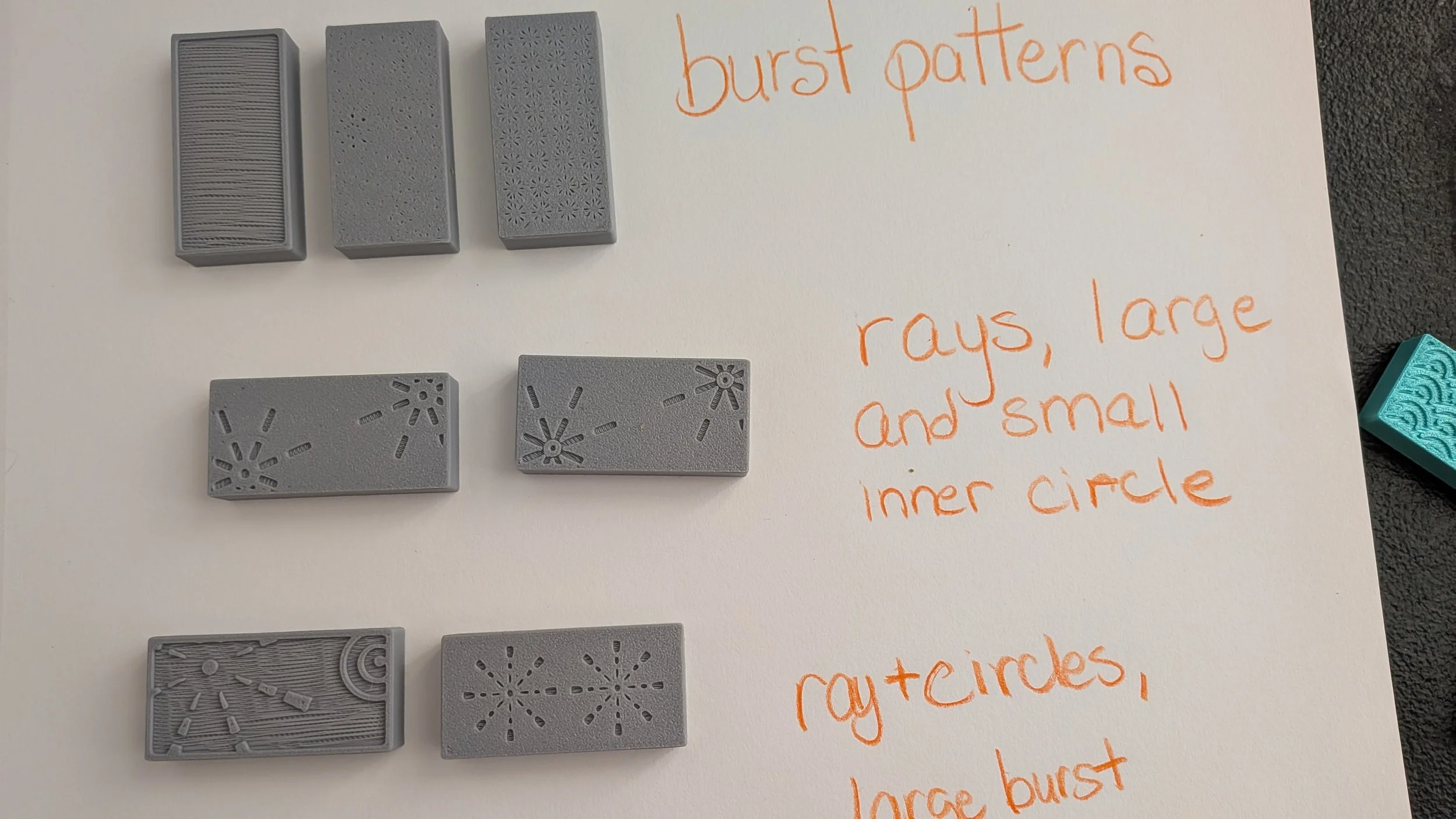
Prototypes for Hanabi, Design Only, No Contrast Color. Hanabi literally means something like ‘Flower Fire’ or ‘Fiery Blossom’
The Wagara Choices
Winter: Seigaiha
The first set, and the one I'm highlighting in the next article, is the winter one. Because I chose water for this one, and blue, a wave pattern seems the only best choice. Fortunately there is such a pattern: Seigaiha, which roughly translates to 'blue ocean waves'. According to Madam Zozo, this repeating wave design was used on Chinese maps, to describe oceans, and symbolizes good fortune.The pattern consists of arcs, stacked on top of one another, usually with trimmed sides that make the final shape somewhere between a rainbow and a fan. These shapes are placed side by side, til a row is complete. The exact same row is placed below the first, but offset by a half a fan shape. This process gets repeated til the artist has enough to fill the desired shape: the result is a mesmerizing pattern that looks like ocean waves.
Doyo: Kikko
It may not be a season itself, but doyo is part of each season. Specifically, it’s the 18 days preceding each season, each of those transitional periods with its own name and customs as described in the Kagoshima Visitor’s Guide. Doyo is associated with earth, so I chose yellow for the color. The tortoise has associations with longevity in Japanese folklore; Japanese Weekender specifically references a folk tale about a long-living fisherman and a turtle. That longevity, combined with the creature’s hard outer shell, made me feel like it was a good mascot for earthy doyo.
Kikko consists of rows of hexagons, which when tiled correctly give the appearance of a tortoise shell. That sounds like the perfect finish: Doyo/yellow/earth/tortoise/kikko. To make this pattern requires nothing more than first repeating a hexagon shape til one has a row of hexagons end-to-end. After that, copy the row, move it over a bit, and drop the copy down to nest comfortably into the upper row. Rinse and repeat.
Spring: Asanoha
For spring I wanted something flowery, or perhaps a leaf pattern, so I went with Asanoha, the hemp leaf pattern. Wood was the element, green the color. The blog Wild in Japan references ‘swallow-tailed suits’ as a type of Japanese clothing, a kata named after the swallow, and even swallows on traditional decks of hanafuda (an old card game). The author also claims that the bird-swallow is considered lucky, a claim I had seen before but I don’t remember where so can’t cite it. The bird seemed culturally significant regardless, and also it’s cute — it’s in!
It’s a pretty pattern, with its six diamonds radiating from a center point, like slender leaves. I also liked the choice of plant for another reason: according to both the wagara sources cited below, the hemp plant is known for its durability, something I associate with surviving winter.
Summer: Hanabi
Hanabi is Japanese for fireworks. While I am not certain it’s a wagara pattern exactly, the design was made popular during the Edo period of history, shortly after fireworks were becoming popular in Japan. For this next bit I lost my citation. AI keeps assuring me I am so incredibly spot on, but without a citation, this part falls under speculation, “People wanted to wear these pretty new bursts on their clothes. However the bursts didn’t take a lot of room, so designers also added spirals and circles, lots of interesting things to fill the space.” If I can find the source again I’ll post it. Meanwhile I wanted something fiery and gorgeous for summer, what better than a hanabi pattern? Red was an easy color choice, fire is the element for summer, and I chose fireflies as the creature.
I actually finished the back for this set. I tried seven different prototypes, including two large bursts, a set of smaller ones, a tiled set of bursts, and portions of bursts with spirals and circles. The one I chose to use has a large portion of a firework burst, which necessarily includes a few dashed rays, and about 85% of a series of concentric circles, balancing out a large amount of otherwise empty space.
Autumn: Yagasuri
The last of the set, it was also the hardest to decide on. Autumn’s element is metal, so either a metallic color or any of the red-gold hues of falling leaves would do nicely for the season. I opted to go with silver for the visual impact. Yagasuri, the arrow feather pattern, looked like it would tile beautifully. I also feel like feathers for fletching and silver that can be worked are equally practical, so these match thematically. One thing I was certain of: I wanted a deer for autumn. There is a decided lack of land critters in my set, and deer are pretty. Since I’m adding some ingredients for a bow and arrow (silver and feathers) I’m going to show the deer in flight, leaping away to safety, so cute :)
This pattern looks like rows of chevrons in alternating colors, stacked on top of one another. Each chevron has a thin stripe of the opposite color in the center. When tiled the pattern looks like lots of feathered ends of arrows.
Continued in Part Two, “Creating the Seigaiha Set”
In the second part we'll learn how to make and apply seigaiha patterns to the back of the dominoes. We'll also learn how to use high contrast prints to make a cool box, with the same pattern on the inside of the lid, while being totally invisible on the outside, all using nothing more than an ordinary 3D-printer and the filament swap technique. Until then, happy printing!
Bibliography
Madam Zozo
Wagara: Traditional Japanese Patterns & Their Meaning
Duende by Madam Zozo
Kagoshima Internationalization Council
The Doyo Period ~ It Comes Around 4 Times a Year! When? Its Origins and Customs?
Kagoshima Visitor’s Guide
18 Jan 2025
Sato, Aya
Wagara: Japanese Patterns and What They Mean
Tokyo Weekender
04 Jul 2024
wildinjapan
Wild In Japan
15 Jul 2019
Jinta Hirayama’s Japanese Fireworks: Hanabi Illustrations
Art Meets Science